Light Boxes with Push Through Style illumination Effect
The intricate artistry of crafting push-through lightbox signs, meticulous considerations, where every detail plays a pivotal role in the creation of these illuminated marvels.
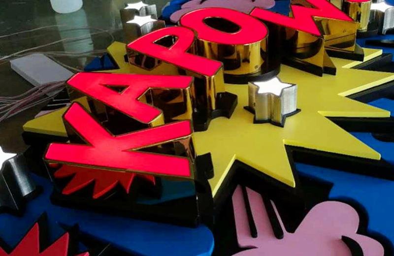
These types of light boxes are known as a step up from a conventional standard light boxes signage because of the stand out 3d graphic letters and logos appear to have a “pushed through” effect on the face panel of the illuminated sign creation.
Boldly the “push through” design in acrylic material, defines this evolution contributing to its identity. The magic lies in the translucency of cut-out areas, allowing light to dance through, giving birth to a captivating sign image. These light-boxes can be constructed in various ways, using different styles of fabricated metal construction techniques, available in different sizes and finishes. To add the final brushstroke to our masterpiece, we carefully select an acrylic that snugly fits into the raised sections, bringing a three-dimensional aspect to our illuminated creations. The result is not just a sign; it's an artful manifestation of light and shadows.
The face panel is designed to block light except for translucent cutout areas where logos and letters are placed. The light is blocked by the solid metal face panels and the light only travels through the negative (cut-out) areas of the face panels. The process is referred to as intra-cut lettering. The illumination happens through the cut-out logo and lettering graphic areas, which are translucent allowing the light and illumination to create the sign image.
The visual illuminated graphic finish is further enhanced by raised solid translucent opal acrylic that fits into the missing cut-out sections to form the three dimensional look, creating a protruding illuminated sign result. The construction style, if you look very carefully, creates a shadow line effect at the edges of letters and logos, adding depth and dimension to the luminous characters.
When colour matching is imperative, if the cut out letters or logos are required to match branding, we achieve this by either using standard coloured acrylic sheets but do have a limited colour range, otherwise for a more accurate colour match we use self adhesive translucent vinyls which are applied onto the acrylic cut letters to create the desired colour.
The enchanting possibilities and another choice can be to have solid flat metal letters adhered onto the raised acrylic faces to entirely block out the lighting from the front of the faces to only allow a halo illumination lighting glow out of the sides. A halo of illumination emerges, elevating our creation to a more subtle lighting effect.
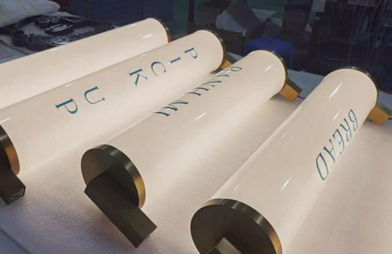
An important part of the final sign which needs to be considered is the aesthetic appeal of how the metal face panels are attached that no fixing is exposed. A mandate that shapes the visual elegance of our creations. The box must be designed in a way that it can be easily opened for maintenance, cleaning and to replace the light source when necessary. A very tidy illuminated signage creation is our single single sided round lightbox signs.
iSpace, backed by 27 years of excellence with numerous signage awards ensures a hassle-free process. We provide expert advice and specialised knowledge to designing and installing illuminated signage, according to regulations, as well as installation services through licensed electricians and network of installers Australia-wide. In the world of signage creation the small attention to detail is a must in the creation of illuminated brilliance.

Slim anodised aluminium light-box
The challenge in making this illuminated sign, incorporated the design intricacy and meeting stringent standards. Tasked with manufacturing a top-tier slim lightbox for the Australian government, our endeavour delved deep into precision. The detailed government emblem, demanded meticulous attention. Bespoke brilliance in every detail was clearly considered in the precision manufacturing, and seamless installation bringing this creation to life.

Precision-made intricate Australian Government logo with illumination
Each curve and line was etched with precision, ensuring fidelity to the original design. But beyond aesthetics, the lightbox's backlit treatment stood as a beacon of excellence. Designed to illuminate the emblem with unparalleled clarity, it met and surpassed the rigorous criteria set forth by Australia's discerning authorities. This creation was an extremely challenging project and required the 27 years of iSpace's metal fabrication expertise.
Bond white illuminated graphics always tend to stand-out
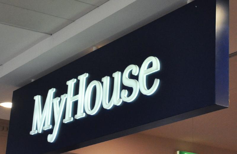
In the bustling retail world, where every glance competes for attention, the strategy of standout signage becomes paramount. White illuminated 3D push-through style logo is a beacon amidst the visual clutter. Set against a dark backdrop, this luminous creation possess an innate magnetism. The three-dimensional lettering depth not only adds a tactile allure but also casts intriguing shadows, creating a dynamic interplay of light and shade. This contrast, coupled with the radiant glow, captures wandering eyes, drawing consumers attention.
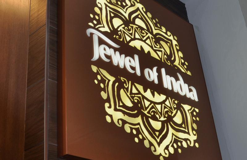
Extremely interact illuminated sign with raised letters
Located within the vibrant food campus of UNSW University is our clients Indian food take-away. Dominating the space is an illuminated sign, meticulously crafted by iSpace with push-through style illumination. Every contour of the signage glows with a brilliance, capturing the essence of India's rich heritage. But it's not just about light; it's about interaction. As students pass by, the sign beckons, inviting them into a sensory journey. The intricate branding, coupled with its radiant allure has becomes a landmark, a meeting point, and a conversation starter. In the tapestry of UNSW's bustling campus life, this luminous beacon stands out as captivating as the flavours it promises.
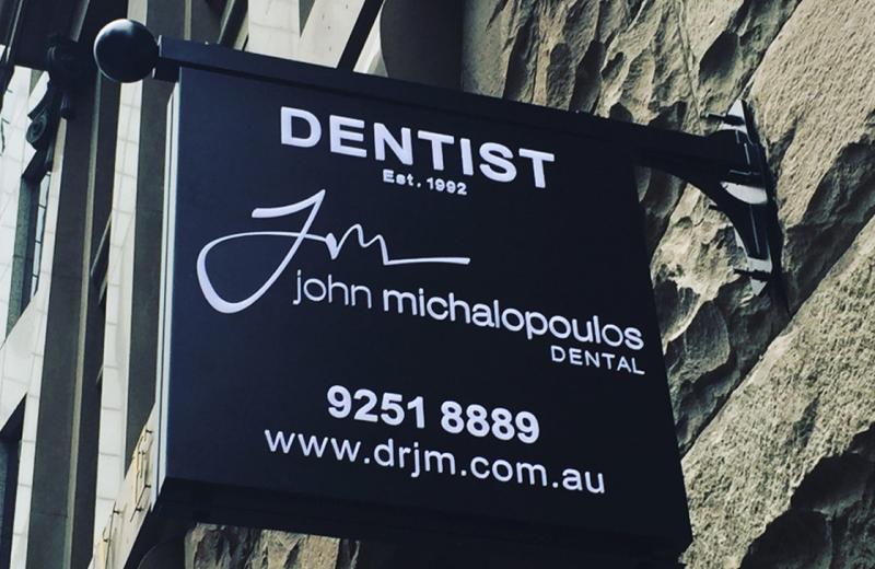
Heritage style cantilever illuminated sign
A challenge to blend contemporary aesthetics with heritage reverence we were tasked with illuminating a dentist's sign of meticulous craftsmanship. The easy to read 3D push-through style light-box emerged as a harmonious addition to the buildings facade, paying homage to the building's past. Recognising the building's art-deco lineage, we sculpted a bespoke bracket, echoing the era's signature motifs. The top mounting bar, adorned with a spherical component complimented the design of this dentists illuminated sign.

Ice white opal acrylic push through lettering
illumination often falls short of capturing the imagination when flat, devoid of depth, and can easily fade into the background. However with the technique of 3D push-through style illuminated letters, and the narrative transforms.The brilliance is in the radiant glow with shadows and reflections. Each contour becomes a dynamic interplays of light, elevating the signage from mundane to mesmerising. When juxtaposed against a stark black and white palette, the contrast becomes even more pronounced, turning a simple logo into a bold statement.

Global brands take illuminated signage seriously
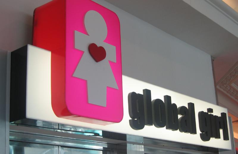
In public spaces, where impressions are lasting, global brands recognise the power of illuminated signage. These luminous displays are strategic ambassadors, tirelessly representing a brand's ethos and promise, 24/7. Global giants understand that in competitive arena, visibility is paramount. The meticulous attention to detail in crafting signage that not only stands out but also resonates with consistency across continents. In the pursuit of visibility and impact, illuminated signage emerges not just as a beacon in the night but as a testament to a brand's commitment to be seen and remembered.

Fabricated circular shape illuminated signage
In design, simplicity often speaks volumes, and for one of our clients, less was undeniably more. Before crafting this illuminated sign, the mandate was clear: embrace simplicity, embrace sophistication. The design encompassed a circle minimalist shape 3D push-through letters, adding a tactile depth, with a satin paint finish played its part in enhancing the elegance, lending a soft luminance that was both inviting and understated. The result was simplicity that commanded attention with an uncluttered, thoughtful design.

Translucent highly visible retail illuminated letters
In the intricate display of light and colour, few combinations captivate as profoundly as blue. illuminated letters crafted from a translucent blue acrylic was enhanced by the strength of blue LED lighting as a back source lighting. Set against a glossy dark blue backdrop, these radiant letters mesmerise the consumer. The juxtaposition of shades creates a visual feel, where the letters seem to almost float. This tasteful alignment of colour and light transforms a simple sign into a poetic statement.

Opal acrylic lettering with lighting during manufacturing stage
In our testing process illumination isn't merely an accessory it's the very essence that brings a design to life in signage. The importance of this luminosity cannot be overstated. For, in the absence of proper lighting, even the most meticulously crafted letters or logos can lose their impact. Quality LED lighting ensures consistency and clarity and energy efficiency to create longevity. Its true prowess lies in its ability to cast a uniform glow. Each letter, each curve and contour, is covered in light of equal intensity, ensuring there are no shadows.

Bronze powder coated flameless box with 3d white letters
Navigating the intricate dynamics of shared spaces, where three distinct businesses converge under one roof, demands a signage solution that harmonises without overshadowing. Each letter, with its pronounced depth, stands as an emblem of individual identity within the collective space. Our sleek, edgeless frame which allows for innovative design and easy access, ensuring maintenance is hassle-free. A neutral palette was chosen and curated where the design and purpose welcomes clients with understated elegance and clarity.

Wall mounted double sided slick dental sign
In the world of dental care, where precision meets artistry, a signage design emerged that encapsulates both. Introducing a square-shaped mint green, double-sided lightbox with an aesthetic finesse. The absence of a border amplifies its sleekness, allowing the sign to seamlessly integrate with its surroundings while maintaining its standout presence. 3D illuminated lettering takes center stage casting a glow, with the letters in shades of white and grey contrast adding depth and dimension. The crisp white border, while subtle, serves as a beacon when illuminated.

Copper & Brass metal Letters attached to the retail sign
In the heart of Sydney's CBD, a renowned restaurant engaged iSpace design team. The challenge was clear, to create a luminous masterpiece that marries tradition and modernity in a symphony of light and metal. Harnessing the timeless allure of real copper and brass, the 3D letter faces shimmer with an opulence. Each letter was meticulously crafted with dedication. The seamless integration utilising an existing old sign box frame, we breathed new life into familiar surroundings. The result is a sign that radiates sophistication, honouring the restaurant's rich heritage.

Huge round illuminated sign for Solotel Group
Innovation often lies in the details, in this project the details were paramount which included an extra-large round lightbox. Its design not only sought to captivate but also to seamlessly integrate with its surroundings. Purposefully sunk into the exterior woodwork, the result was a flush, harmonious installation that involved of meticulous planning and execution. Recognising the importance of maintenance, every element was engineered for accessibility without compromising the sign's sleek profile. Part of the dynamic visual appeal was to incorporate flashing LED lights as a mesmerising focal point, grabbing attention and casting a radiant glow.

Large illuminated signage display inside window frontage
Located in Circular Quay in Sydney capturing attention and admiration alike, a large slim lightbox with striking 3D lettering and bold graphics invites visitors from afar. Its design, both modern and commanding, signage stands unrivalled in its prominence. However, its grandeur was not without its challenges. Nestled within a narrow entrance, the installation posed logistical complexities that demanded ingenuity and expertise. This illuminated masterpiece stands as a testament to vision, and the seamless integration of artistry and engineering which invites all to pause, admire, and be captivated.
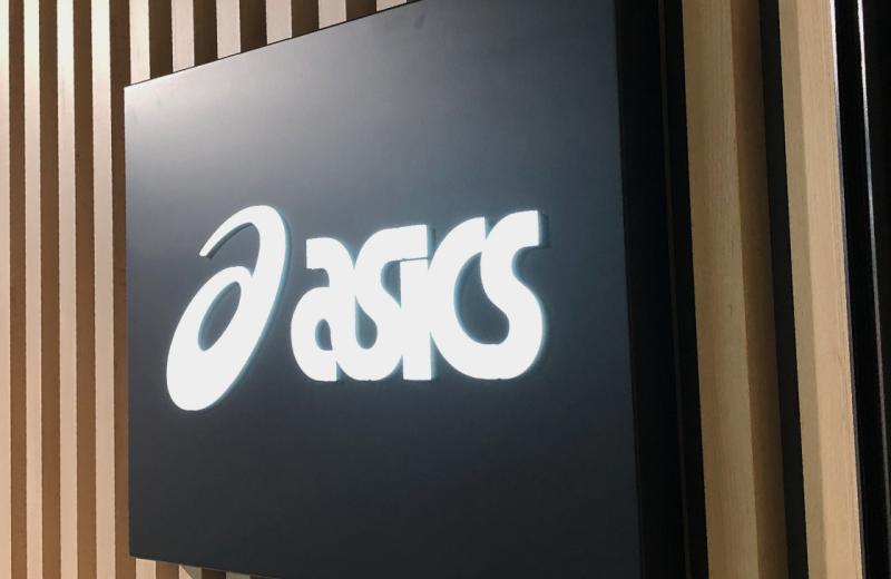
Satin black light-box with white raised logo
In the world of signage when bringing brands to life with clarity in multiple locations, the ASICS lightbox emerges as a paragon of elegance. Crafted with precision, the black folded frame encapsulates a minimalist style, underscoring the brand's commitment to both aesthetics and affordability. At its heart, the ASICS logo shines in a pristine white, standing as a beacon of clarity against the backdrop. This deliberate choice not only amplifies the brand's iconic emblem but also accentuates the lightbox's sleek design. What sets this piece apart is its seamless fusion of sophistication and cost-effectiveness.

3d push thru graphics in out slim lightbox extrusion
Stepping into Hostplus's office reception, one is immediately greeted by more than just a space, it's an experience. Central to this ambiance is an illuminated sign, meticulously crafted to breathe life into the Hostplus logo, a beacon of trust in Australia's super fund landscape. Designed as a feature piece, this illuminated emblem doesn't just represent a brand; it embodies Hostplus's commitment to excellence and innovation. With its smart, luminous presence, it captures attention while subtly conveying the fund's core values. Translucent vinyl, flawlessly colour-matched to the PMS hues of the logo.

Close up photo showing opal acrylic letters illuminated
In the world of illuminated signage, it's the nuances that often captivate the most. 15mm opal acrylic letters with meticulously craftsmanship. These letters, delicately positioned , rise above the sign's surface with an understated elegance, casting a shadow-line that emphasises light and shadow. The brilliance lies in their subtlety flat, but slightly elevated, they capture and play with ambient light, creating a mesmerising shadow-line effect. This dynamic interplay ensures that the signage is not just static. It's alive, shifting with the viewer's perspective. These acrylic letters, simple in form yet profound in impact.


